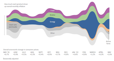
This stunning chart is worth a look by all those who present data at conferences or in classes.
The source of this chart and four more useful charts is an article on inflation by Flowers and Siegel of the Washington Post 10 June 2022.
I recommend a look at the other charts as well.
An additional comment. Charts about economic issues like the cost of food and energy are also about human behavior. People raise prices and people pay more for what they need or want. Too often we separate the cost of things from what people are doing.
I write about presenting data using charts in Creating Surveys.
Buy Creating Surveys on

Links to Connections
Checkout My Website www.suttong.com
See my Books
FOLLOW me on
FACEBOOK Geoff W. Sutton
TWITTER @Geoff.W.Sutton
PINTEREST www.pinterest.com/GeoffWSutton
Read my published articles:
ResearchGate Geoffrey W Sutton
Academia Geoff W Sutton
Comments
Post a Comment