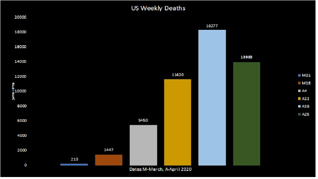
Are we there yet? The most recent weekly data suggest a downward move in the number of people who died in the past week.
In the previous chart, there appeared to be a channel or range between 1800 and 2000 per day with some anomalies. Now that we have more data, it is possible to group the data.
I am avoiding curves and means because it is not clear that there is a curve or that the data are normally distributed. The bar chart offers a clear picture of rapid increase and possibly (and hopefully a decline.
In this chart, I used weekly totals beginning with March 7, 2020 (M = March, A = April).
Important note: The numbers may be revised. This chart is for educational purposes only and not for planning.
Here is my source for the data https://ourworldindata.org/grapher/total-daily-covid-deaths
Date Deaths
| M21 | 213 |
| M28 | 1447 |
| A4 | 5450 |
| A11 | 11620 |
| A18 | 18277 |
| A25 | 13963 |
Read more about statistics in these two books.
Creating Surveys on AMAZON
Read more about basic statistics in APPLIED STATISTICS: CONCEPTS FOR COUNSELORS at
AMAZON
Connections
Publications (many free downloads)


Comments
Post a Comment